In this article, we are going to discuss what is website responsiveness and its importance in the blogging and internet marketing world.
As the Internet grows, many businesses have marked their online presence through a website or a blog. There are nearly 1000’s of websites and blogs launched every day.
Previously, users have used only desktop computers with a standard screen size and web developers designed webpage’s to fit the desktop screen.
As the technology grew, desktop computers have turned into laptops, laptops into smartphones, tablets and finally now Smartphones. The smartphones have the smallest screen sizes.
Google reported more than 70% of the Internet traffic are routed through mobile devices now and hence Google is pushing web developers to create a responsive design of websites.
Table of Contents
What is a Responsive Web Design?
It means that the web content or layout is flexible to fit within the different screen sizes where they are displayed. If you are watching this website on desktop, the layout might be different from that of mobile. However, the components will almost be the same. This is because marketing91 is responsive in its design. The smaller you make the screen of the browser you are on, the more the site will adjust to the adjusted screen size.
A responsive website design is an approach to a web design coded to render layout properly on different screen sizes or a variety of devices. A special code is used to bring this responsiveness which is called as CSS Media Queries and these begin with @Media.
It allows the page to use different CSS style rules based on the device sizes, these codes paints the content layout properly. This website responsiveness approach is also called as Fluid grid system of web design.
Types of Responsive Design:
Nowadays 90 out of 100 people are using smartphones or tablets to browse the internet. In fact, sales of desktops has dropped drastically in the last few years and even the sales of laptops are dropping because smartphones can do almost everything laptops can. Hence a standard designed website may not fit these different devices and it creates difficulty in reading the content.
Many users feel uncomfortable if there is absence of website responsiveness and they may leave the site sooner which leads to decreased traffic and revenue loss.
When speaking about website responsiveness, there are three basic designs to choose from:
- Responsive Layout
- Fluid Layout
- Fluid-responsive layout
3 Different types of Website Responsiveness
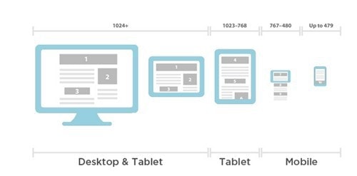
1) Responsive Layout
It is also called as an adaptive design where each block of the web pages is coded with fixed width, usually expressed in pixels.
These fixed widths are usually made adaptive to fit within the screen sizes using a special code called as breakpoints achieved by implementing CSS media query rules.
2) Fluid Layout
The fluid layout design is similar to the responsive layout with some tiny changes, where the unit width is usually expressed in relative units called as em or % (percentage).
This approach of website responsiveness is a time-consuming process because each and every block of the web page should be tested for their behavior.
The behavior signifies the various movements such as stretching, left or right alignment in any direction, placement of different elements to the top or the bottom of the successive elements etc.
3) Fluid-responsive layout
This method of the design includes the common functions of the responsive layout and the fluid layout.
It includes certain special codes called as breakpoints achieved by implementing CSS Media Query Rules, which changes the fluid behavior as mentioned above.
The responsive layout is the most commonly used method of designing the website as it is the easiest and fastest way to create a beautiful and functional website.
Importance of Website Responsiveness
1) Increasing penetration of Mobile
Website responsiveness has become more important nowadays as more than half of the traffic to a website / blog is through mobile devices. Even Google has launched their own algorithm updates which states that mobile responsive sites will rank higher as compared to non-responsive websites.
2) Better User Experience
Responsive web page layout is very flexible on all screen sizes and the resolutions thus creating a unified appearance. It doesn’t matter whether the user visits your website through Smartphone or laptop, a flexible layout will let the user easily navigate giving optimal experience.
All websites require proper call to actions in place. When you have a responsive website, you can have call to actions in place looking at the screen resolution. Thus, the CTA’s will be smaller on mobile whereas they will be larger on desktops.
3) Improve Brand Reputation
The website responsiveness increases the scope of user experience thus creating a positive perception of your brand and the business. This makes them revisit your website more times in future and thus helps in increasing sales and turnover.
4) Improve Search Engine Ranking
Google officially declared that responsive layout is an important ranking factor in their search results. As SEO is an important factor for any website, it is always better to have a responsive website.
5) Improve page speed
Since the flexible layout employes very few CSS files to render Web Pages, it eliminates time dependency in CSS file downloading. A responsive website means you have only one website for all users of different screen sizes thus eliminates the hectic process of maintaining different version of sites. A responsive website also means better caching at server end and hence lesser server resources being used and a faster website.
6) Efficient and cost effective
Starting and running an SEO campaign is much simpler and smoother with a mobile-friendly website. Running cost is also less for responsive websites because a single version of the website is enough to serve different users.
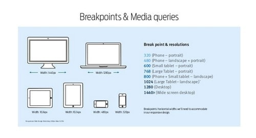
Understanding Media Queries for Website Responsiveness :
It is an additional module in CSS3 that allows web page content to render and adapt to the different screen sizes such as computer screen, Smartphone screen, tablet screen etc.
These media queries consist of one or two expressions and one media type values to evaluate the various functions.
When the media query matches with the type of the device and if the expression in the query nulls, then the new value is applied to all the CSS elements.
This is the most important component in the website responsiveness.
Tips for a perfect responsive website:
Following are the important tips to follow in designing a perfect website layout that adapts to different screen sizes.
Set the View Port: Use “width=device-width” to match the screen width with the values declared in the CSS codes.
Include “Initial-scale=1” to establish 1:1 ratios between the screen size and the CSS pixels.
Use Media Queries: This rule instructs the CSS to apply various styling elements to the webpage to fit within the content.
Use “min-width” and “max-width” to ensure the smooth operation of these media query instructions.
Use Relative Sizes: When declaring values to the “width” attribute, include em or % value instead of using fixed width px (pixels).
Create Breakpoints: This is useful to create a more flexible layout to serve a wide range of screen sizes.
Design for the smallest breakpoints and then progress the aiming highest screen size.
Do not use largely fixed width elements anywhere on the website.
Conclusion :
It is very important to have a responsive website for your online business such as Blogging because you never know how your users use your website.
Mobile responsiveness means delivering the same content to your audience in the way they like viewing it.
If your website or blog is not mobile friendly, it’s time to decide and bring a change to your layout.
The ultimate motto: One Content, Multiple Version.
Liked this post? Check out the complete series on Digital Marketing
Thank you so much for sharing a great article. Keep up the great work!
Good article and excellent way to articulate, keep it up
The facts have been discussed are really important, keep up the good work