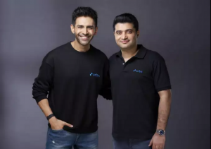
The market demand is always varying due to various factors. One factor can be production and product availability. Another factor can be the price of the product. Because of the huge impact of price on the sale of a product, the market demand curve is generally plotted keeping price and quantity in mind.
Individual demand curve
Before we explain market demand curve, let us explain individual demand curve. The individual demand curve is plotted by taking the individual’s demand into consideration at varying prices of the product.
The demand for an individual may vary if the price of the product is not constant. If I had to buy an Oreo biscuit, then my demand may rise or drop due to the price of the biscuit in the market. If Oreo increases the price, my demand might drop. If Oreo drops the price, I might buy larger volumes of Oreo Biscuit.
Example of Individual demand curve
Thus, my individual demand curve can be plotted as follows
What is Market demand curve?
The market demand curve is the sum total of all Individual demands in the market. A market may consist of 1000’s of customers. The net demand of all those customers at varying prices of the product is used to determine the market demand curve for the product.
When the price is higher, the demand might drop whereas when the price is lower, the demand might rise. By keeping price and quantity on the different axis, we can plot a demand curve which tells us the average demand in the market for a varying price or quantity.
This curve is calculated by taking data from market population and then using the total of that data to plot the market demand curve.
Example of Market Demand Curve
Let us take the consumption of Oreo Biscuits as an Example. Oreo wants to plot the market demand curve of its biscuits in a region X. This region has 2 different distributors with different demands.The distributors can share the market consumption patterns at various prices to plot the market demand curve. Let us understand with a table.
As can be seen from the above graph, the demand for distributors drops with an increase in price. As the distributors are the sole point of sales for region X, it is safe to assume that they represent the complete population of region X.
The graph is so simple that it can be extrapolated with a huge sample size. A complete country and all its distributors can be taken as a sample size to determine what is the level of change in demand when the price changes.
How to plot your own Market demand curve?
- First, determine the market for which you want to plot the market demand curve.
- Determine the individual demand of that market. If it is an industrial firm, then you can take demand of each company. If it is a B2B firm, then individual demand of your dealers or distributors can be taken.
- Take an opinion poll of what demand they will get if they increase the price of the product. Determine individual demand of each customer/ dealer/distributor for varying prices with a market research study.
- With the individual demand figures in hand, calculate the total demand at a given price for a particular product.
- Plot a graph of the total market demand vs the price of the product. This will be your market demand curve.
Uses of the Market Demand Curve
The Market demand curve can help determine the price of the product. A company always wants to reach the middle line between keeping a high price vs the quantities liquidated in the market. If the company keeps the price low, then it will not earn profits. If it keeps price high, then it will not liquidate enough quantities in the market.
A demand curve can help companies determine the midpoint of demand vs price. Thus, the company can come up with a price where the demand is respectable as well. The company can drop prices when it is season time to ward off competitors. The company can also raise prices if it wants to have a premium positioning.